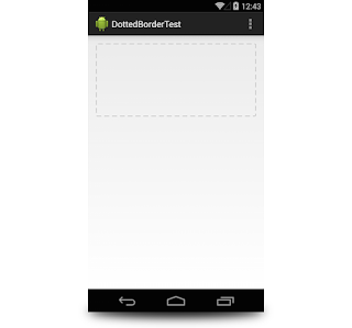
Step 1.
Create a resource file in your drawable folder just as follow :
<?xml version="1.0" encoding="utf-8"?>Step 2.
<shape xmlns:android="http://schemas.android.com/apk/res/android">
<stroke
android:width="2dp"
android:color="#cccccc"
android:dashWidth="10dp"
android:dashGap="6dp"/>
<padding android:left="7dp" android:top="7dp"
android:right="7dp" android:bottom="7dp" />
<corners android:radius="2dp" />
</shape>
The key properties for the dotted line here are dashWidth and dashGap. As said by their name, dashWidth allows you to set the width of each dot and dashGapthe width of each gap between dots.
You could also specify some padding and corner radius properties to not make design lovers cry too much. ʘ‿ʘ.
Then, just link this drawable to the background property of your layout.
<FrameLayout
android:id="@+id/container_with_dotted_border"
android:layout_width="fill_parent"
android:layout_height="150dp"
android:padding="40dp"
android:background="@drawable/dotted_border">
</FrameLayout>

ConversionConversion EmoticonEmoticon